Top 10 No-Code Tools for Creating Bar Chart Race Videos
Introduction: Bar chart race videos – those hypnotic animations of bars sprinting to the top of a ranking – have exploded in popularity as a dynamic way to visualize data over time. They bring numbers to life in a fun, engaging format, helping viewers easily grasp how values change across years or categories. The best part? You don’t need programming skills to make them. A wave of no-code tools now empowers content creators to build these animations with drag-and-drop simplicity. In this article, we’ll introduce the top 10 no-code tools for creating bar chart race videos (as of mid-2025), each with a friendly deep dive into its features, use cases, pros, cons, and pricing. Whether you’re a YouTuber, teacher, marketer, or just a data enthusiast with no coding background, these tools will have you crafting captivating bar chart races in no time!
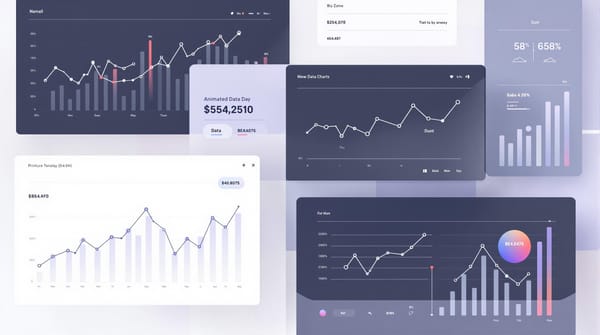
[Insert an engaging graphic of a bar chart race example]
1. AlienArt.io – Data Storytelling in Video Form
AlienArt.io is a newcomer focused on turning data into videos effortlessly. It provides a canvas-style editor for creating bar chart races and other animated charts, all within your web browser. Designed with visual storytelling in mind, AlienArt lets you layer multiple charts, add titles or images, and export the result as a polished video – perfect for social media or YouTube. Beginners appreciate its friendly interface and ready-made templates, while power users enjoy the creative freedom to customize colors, fonts, and more.
Key Features:
- Layered Video Compositions: Combine multiple charts or elements in one video using an intuitive timeline and layers. This unique feature makes AlienArt stand out for multi-step storytelling.
- Ready-to-Use Templates: Jumpstart your project with templates for common bar race themes (e.g. top companies, popular songs) – no design skills needed. You can still tweak animations and styles to your liking.
- Direct Video Export: No screen recording hacks here – AlienArt exports your project straight to an MP4 video file at the click of a button. It even works from a mobile browser, so you can create and download videos on the go.
- Data Import Options: Easily import data via CSV, Excel (XLSX), or even a Wikipedia page link. The tool will handle the heavy lifting of transforming it into a racing bar chart.
Pros:
- Beginner-Friendly: No coding and no steep learning curve. The interface is intuitive, with a step-by-step flow (import data → customize design → export video) clearly outlined.
- Visual Customization: Offers lots of control over look and feel – choose colors, fonts, add icons or logos, and adjust animation speed to make your video on-brand.
- Mobile Support: One of the few tools that lets you create and export bar chart race videos entirely on a mobile device. Great for creators who prefer working on a tablet or phone.
- Community & Templates: A growing library of user-created projects and templates to draw inspiration from, plus a supportive community of fellow data storytellers.
Cons:
- Free Plan Limitations: The free tier limits you to 30 minutes of video exports per month (max 3 minutes per video) and adds a watermark. Heavy users will bump into these caps quickly.
- Relatively New Platform: As a newer tool, it may not have as many templates or tutorials as more established competitors (though it’s expanding fast). Some advanced chart types beyond bar races might still be in development.
- No Interactive Embeds: AlienArt focuses on video output. If you need an interactive web embed of a bar race, you’d need to use a different tool – AlienArt’s strength is in video storytelling.
Pricing: AlienArt.io offers a robust Free plan (with the limits noted above) so you can create videos forever at no cost. For unlimited, watermark-free exports, the Pro plan is $19/month (or $180/year). The Pro tier supports longer videos (up to 20 minutes each) and is ideal for serious content production. A free trial is available to test Pro features. Considering its focus on video and ease-of-use, AlienArt provides great value for social media content creators, educators, and anyone who wants to quickly turn data into engaging bar chart race videos.
2. Flourish – Interactive Bar Race Charts with Ease
Flourish is a veteran in the data visualization space, famous for popularizing the bar chart race format. Now part of the Canva family, Flourish enables you to create interactive and animated charts (including bar races) without any coding. Simply upload your dataset to its web app, select the pre-built “Bar Chart Race” template, and watch your bars start racing! Flourish’s strength lies in its rich customization options and professional-quality output, making it a go-to for both beginners and advanced users who want slick visuals.
Key Features:
- Ready-Made Race Templates: Flourish provides a dedicated bar chart race template that handles the animation logic for you. You just map your data to the expected format, and the platform generates a smooth time-series race.
- Flexible Customization: Tweak almost every aspect – colors, fonts, bar labels, axes, speeds – to get the exact look you want. Flourish balances ease-of-use with the ability to fine-tune designs, pleasing both novices and data designers.
- Live Data Integration: For those who need it, Flourish supports connecting your chart to live data sources like Google Sheets. This means you could update the data and refresh the race without rebuilding from scratch – useful for dashboards or ongoing projects.
- Canva Integration: Since Flourish was acquired, you can embed Flourish projects into Canva designs seamlessly. This is handy if you want to incorporate your animated chart into a larger video, slideshow, or graphic in Canva.
Pros:
- Easy and Quick Start: Very low learning curve – many users can create their first bar chart race in minutes by using the template and sample dataset as a guide. Great for beginners.
- Polished Visuals: Flourish produces high-quality animations with smooth transitions and professional designs out-of-the-box. The results tend to look “high-end,” which is why it’s favored in journalism and marketing.
- Interactive Sharing: You can share your Flourish bar race as an interactive HTML embed or via a link, allowing viewers to play/pause or hover for details. It’s not just a video tool – it’s an interactive content tool (though you can turn it into video as noted below).
- Generous Free Plan: Flourish’s free tier includes most core features and unlimited public projects. Casual creators can do a lot without paying, as long as they don’t mind their charts being publicly viewable on Flourish’s site.
Cons:
- No Native Video Export: A known drawback – Flourish doesn’t have a one-click video download on the free plan. Exporting a bar race to video typically requires opening the animation full-screen and using a screen-recording tool. This extra step can be a hassle if you need a standalone video file. (Pro tip: some Flourish paid plans or using Canva’s integration might simplify this, but it’s not as direct as some other tools.)
- Privacy and Branding (Free Plan): With a free account, all Flourish projects are public on your profile, and you’re somewhat limited in using custom logos or themes. Companies or creators who need private projects and full branding control will need a paid plan, which can be pricey.
- Large Dataset Performance: While Flourish can handle moderately large datasets, very extensive time series with many categories might make the editor sluggish. Extremely large races (e.g. thousands of bars or very long time spans) could require simplification for optimal performance.
Pricing: Flourish is free for individual users creating public visualizations. For additional features like private projects, advanced themes, or team collaboration, Flourish offers paid plans. The Personal/Pro plan (around $79/month as of 2025) unlocks private charts and higher export options, while Business/Enterprise plans add team and premium template features. Pricing can be on the higher side, so evaluate based on your needs – many creators stick with the free version and use screen capture for video export if needed.
3. Canva – Design Made Easy, Now with Animated Bar Charts
Canva isn’t just for static graphics – this popular design platform also lets you create animated bar chart races with zero coding. Aimed squarely at non-designers, Canva provides an ultra-intuitive interface and a massive library of templates, elements, and media. To make a bar race, you can use Canva’s Bar Graph maker: input your data (or import a CSV), then choose an “animated” bar chart style where the bars race to their values over time. The result can be downloaded as a video or GIF, or embedded in a presentation. If you’re already using Canva for your social posts or videos, its chart feature is a convenient add-on to animate your data.
Key Features:
- Template Library & Elements: Canva offers numerous chart templates and an elements library that includes an “interactive bar chart race” component. You can drag this into any design, choose a style (colors/fonts), and watch it animate. Perfect for quickly comparing trends like poll results, top 5 lists, etc.
- Drag-and-Drop Editor: True to Canva’s reputation, creating charts is done via simple clicks and drags. Adjust sizes, add labels, drop in images or icons – all without leaving the design canvas. This lowers the barrier for anyone to make an eye-catching data video.
- Collaborative Design: Multiple people can collaborate on the Canva project in real-time (useful if you’re working with a team on a video or infographic). You can comment and edit together, even on the charts, which is great for group projects or client work.
- Multi-Format Export: Canva allows you to publish your bar chart race as a video file (MP4), GIF, or even an interactive view on Canva’s website. You can also embed it into Canva presentations. This flexibility means you can create content for various platforms – from Instagram videos to PowerPoint decks – all in one place.
Pros:
- Extremely User-Friendly: Canva is designed for non-techies. Even if you’ve never made a chart before, the guided interface (with tooltips and templates) makes the process approachable. It’s as easy as editing a slideshow.
- All-in-One Platform: Because Canva handles everything from image editing to animation, you can combine your bar race with other visual elements (title slides, photos, music, etc.) in one project. It’s excellent for producing a complete video or social media post without juggling multiple apps.
- Rich Design Options: Hundreds of fonts, color schemes, and illustrations are at your disposal. You can make your bar chart race visually unique and on-brand. Want a funky background or animated stickers alongside your chart? Canva’s got you covered.
- Team Collaboration: If you’re a content team or an educator working with students, Canva’s collaboration and sharing features are a big plus (especially in the paid Teams plan).
Cons:
- Limited Complex Data Handling: Canva’s charts are great for straightforward datasets (e.g., a single series over time). However, it might struggle with very large datasets or complex multi-dimensional data. The customization of the chart’s behavior (like custom scaling or advanced animation timing) is also more limited compared to specialized tools.
- Pro Features Require Subscription: While Canva’s basic features are free, some advanced elements or template designs, and the ability to export with transparent backgrounds or higher resolutions, require a Canva Pro subscription. The free plan also caps team members and lacks brand kit features, which professionals might need.
- Internet Connection Needed: Canva is web-based (though there are offline app versions with limited functionality). You’ll need a stable internet connection while designing and rendering your animated chart, which can be a consideration if you’re on the go.
Pricing: Canva has a Free plan that’s surprisingly feature-rich – you can certainly create and download bar chart race videos without paying. Canva Pro is $12.99/month (or $119.99/year) for one user and unlocks premium assets, expanded storage, and advanced export options. There’s also a Canva for Teams plan ($14.99/month per user) with enhanced collaboration tools. If you frequently create visual content, the Pro plan can be well worth it for the time and design resources you save. For occasional use, the free plan plus some creativity will do the job.
4. Infogram – Professional Data Visuals with Bar Race Animation
Infogram is an established name in online data visualization, now owned by Prezi. It enables users to create interactive infographics, charts, and dashboards, including a specific chart type called “Race Bar Chart” for bar chart races. Infogram’s interface is user-friendly: choose a chart type, input or import your data, and customize the design with its drag-and-drop editor. What makes Infogram shine is its polish and features geared towards presentations and publishing – you can embed interactive charts on websites or export your animated charts as image, GIF, or video for social media. If you want your bar chart race to be part of a larger infographic or report, Infogram is a great choice.
Key Features:
- Race Bar Chart Type: Infogram has a built-in “Race Bar Chart” that automatically animates bars moving over time to reflect your dataset. This takes out the guesswork – just provide time-series data (e.g., years vs. category values) and Infogram will generate the racing animation for you.
- Media and Branding Options: You can enhance bar races by adding images or icons directly onto the bars (such as country flags or company logos next to each bar). This feature, available on all plans, makes your races more engaging and on-brand by visualizing each category with an image – a unique touch that audiences love.
- Direct Video/GIF Export: Infogram supports exporting your projects as MP4 videos or animated GIFs (Pro plan or above). This means you can create a bar chart race and download it as a high-quality video file without any third-party screen recorder. The convenience of one-click video export is a big plus for content creators in a hurry.
- Interactive Embeds and Sharing: If you prefer to keep it interactive, Infogram allows you to publish your bar chart race online and share it via a link or embed code. Viewers can then interact (pause, hover for details, etc.). This versatility lets you use the same project as both a video and an interactive web element.
Pros:
- Polished, Professional Output: Infogram is known for sleek and clean design templates. Even if you have minimal design experience, it’s hard to create an ugly chart in Infogram – everything tends to look boardroom- or newsroom-ready. This is great for professional presentations or client work.
- Ease of Use with Depth: The interface is drag-and-drop and WYSIWYG. At the same time, it offers a lot of depth – you can adjust data ranges, add custom color themes, set animation durations, and even integrate with live data via Google Sheets or API on higher plans. It serves beginners and advanced users alike.
- Collaboration and Cloud Saves: Projects are saved in the cloud, and you can collaborate by inviting team members (on certain plans). It’s handy for teams creating data-driven content. Plus, Infogram being web-based means you can start a project on one computer and continue on another seamlessly.
- Free Plan for Experimentation: Infogram’s free plan allows you to create up to 10 projects with limited features – enough to test out a bar chart race or two. While downloads are limited to lower-quality images on free accounts, you can still play around with the race chart and see results before deciding to upgrade.
Cons:
- Watermarks & Limited Downloads on Free Tier: Projects made on the free plan will carry Infogram branding, and you cannot download your bar chart race as a video or PDF on free accounts (only low-res PNG). To get the MP4/GIF export and remove watermarks, a paid plan is required. This can be a barrier if you need high-quality output without subscribing.
- Learning Curve for Advanced Features: While basic chart making is straightforward, Infogram’s more advanced capabilities (like embedding charts in interactive infographics, using the API, or customizing via the theme editor) can take some time to learn. The interface is packed with options, which might feel overwhelming until you get used to it.
- Cost for Premium Plans: Infogram’s paid plans (Pro, Business, Team) can be relatively pricey for solo creators. If you’re only looking to do occasional bar races, the cost might not be justified, whereas for organizations that regularly produce data content, it’s more reasonable.
- Internet Required for Viewing Interactive Content: If you share an interactive version (rather than a video export), viewers will need an internet connection to see it. This isn’t a problem in most cases, but it’s worth noting if you present somewhere with low connectivity – in those cases, having the MP4 video exported is a safer bet.
Pricing: Infogram’s Basic (Free) plan lets you create up to 10 public projects to test the waters. For serious use, the Pro plan (about $19/month billed annually) allows 100 projects, video exports, and removes watermarks. The Business plan (around $67/month annually) adds unlimited projects, higher resolution exports, and brand customization, while Team plans ($149/month+ for multiple users) enable collaboration and additional features. All paid plans include the MP4/GIF export option – a key feature if you need video output. Educational and nonprofit discounts are available as well. If high-quality, interactive data visualization is your bread and butter, Infogram’s cost can be justified by the professional results and efficiency gains it provides.
5. Visme – Animated Infographics and Charts for Creators
Visme is an all-in-one content creation tool geared towards infographics, presentations, and social media graphics. It allows you to build animated charts and graphs as part of your designs, making it possible to create bar chart races and other animations with ease. While Visme doesn’t have a one-click “bar race” template like some others, you can simulate a bar chart race by using its timeline animation features on bar graphs. In Visme’s editor, any chart you add is pre-animated by default – bars will animate into place – and you can customize the animation style (for example, having bars grow according to data or appear sequentially). Visme stands out for its rich design toolkit integrated with data viz: you can combine charts, text, video, and illustration in one project, making it ideal for storytellers.
Key Features:
- Drag-and-Drop Canvas with Timeline: Visme’s presentation-style editor gives you a slide or canvas where you can add objects. For charts, it provides an animation timeline to control how and when each bar appears or changes. This means you can create a race effect by sequencing the bars’ appearance over time (e.g., one bar updating after another). It’s a bit more manual than a dedicated race template, but it offers lots of creative control.
- Animated Chart Effects: All charts in Visme come with built-in animation presets – for instance, bars can swipe in from the left or grow from zero to their value, etc.. You can adjust duration and delay to orchestrate a bar race. This is great for creating custom-paced animations or mixing multiple charts in one scene.
- Extensive Template Library: Visme offers templates not just for individual charts, but full infographics and presentations that include charts. For example, you might find a template titled “Social Media Trends Race Chart” where much of the work is done – you just plug in your data. This can significantly speed up content creation for beginners.
- Media-Rich Exports: You can download Visme projects as video (MP4) files if they have animations/timings, or as static images/PDF if not. This means your bar chart race created in a Visme presentation can be exported as a standalone video to share on social media. Visme also supports embedding your creations on a website (the embedded version keeps animations interactive).
Pros:
- Visually Engaging Outputs: Visme’s strength is combining data with design. You can create a bar chart race that’s overlaid on a beautiful background, with additional callouts or icons, all within one tool. The result can feel more like a designed video than just a plain chart – perfect for marketing and education where style matters.
- High Customization: You’re not confined to a template’s structure. Each element (including each bar or label in the chart) can be styled. Want rounded bars? Custom colors for each category? Specific font for labels? It’s all easily tweakable. This design flexibility is greater than in some purely-chart tools.
- Supports Multimedia: You can spice up your bar race by adding background music or voice-over in Visme, since it supports adding audio/video to slides. This is a big plus if you’re creating a YouTube video with narration – you could do it all in Visme.
- Brand Kit and Consistency: For businesses, Visme allows you to set your brand colors, fonts, and logo so that any chart or graphic you create stays on-brand. This ensures your bar chart races align with your other marketing materials in look and feel.
Cons:
- Not a Dedicated Chart Tool: Because Visme is a multi-purpose design tool, it may not handle extremely complex data visualization needs as specifically as a tool like Flourish or Infogram. For example, managing very large time-series data or tricky data transformations might require prepping data beforehand (Visme doesn’t have advanced data manipulation within the app).
- Performance: Complex Visme projects (with many animated objects or very long timelines) can get a bit heavy on the browser. If you’re doing a lengthy bar race with lots of elements, you might notice some lag in the editor preview. Export times can also be longer for dense animations.
- Limited Free Version: Visme’s free plan is quite restricted – your projects will have Visme branding, and download options are limited (e.g., you might only be able to download as JPG, not MP4, on free). To fully utilize the animation and export features, a paid plan is needed.
- Learning Curve for Advanced Animation: Basic use is straightforward, but mastering the timeline (to perfectly time a bar chart race, for instance) might take a little practice if you’re new to animation. It’s similar to learning a simple video editing timeline.
Pricing: Visme offers a Free tier for testing, but serious use will require upgrading. The Personal plan is around $29/month (often discounted annually) which unlocks video exports, premium templates, and removes the Visme watermark. The Business plan (~$59/month) adds collaboration, brand kit, analytics, and unlimited projects, which is useful for teams. There are also discounted Education and Nonprofit plans. If you plan to create a lot of animated content (not just charts, but all kinds of visuals), Visme can be a worthwhile investment because it consolidates many tools into one. However, if you only need an occasional bar race video, you might stick with the free plan and use the limited features or explore other free tools on this list.
6. Zoho Sheet (Race Charts) – Spreadsheets Meets Animation
Zoho Sheet, part of the cloud-based Zoho Office suite, offers a nifty feature: Race Charts built right into the spreadsheet application. If you’re familiar with Excel or Google Sheets, Zoho Sheet will feel comfortable – with the bonus that it can generate animated bar chart races from your data without any coding or add-ons. This is especially handy for users who have their data in a spreadsheet already and want a quick way to visualize it over time. You set up your data table, use the Race Charts option, and Zoho animates the bars racing as the values change over the sequence (e.g., by date or year). It’s a simple approach but very convenient for certain use cases.
Key Features:
- Integrated in Spreadsheet: You don’t have to leave your spreadsheet to create a bar chart race. This tight integration means you can tweak your data in cells and immediately see the effect on the chart animation – great for data analysis and iteration.
- One-Click Race Chart: Zoho Sheet provides a chart type called Race under its chart options. Once your data is arranged (usually one column for categories, one for each time period’s values), selecting this chart type will produce an animated bar chart that you can play within Zoho Sheet. It’s designed for simplicity.
- Simple Customization: You can customize basic elements of the race chart – like bar colors, labels, and animation speed – through the chart settings. It’s not as flexible as specialized tools, but enough to make a neat, understandable visual.
- Collaboration and Embedding: Zoho Sheet, being online, allows real-time collaboration. Multiple people can work on the data and chart together (with edits reflected live). You can also publish the chart or embed it (it will remain interactive). Alternatively, you might use screen recording to capture the animation for use in videos.
Pros:
- No Extra Software Needed: If you’re already in Zoho for your data (or if you import an Excel/CSV into it), making a bar chart race is a seamless part of your workflow – no need to learn a new platform. This is great for those who are more comfortable with spreadsheets than design tools.
- Real-Time Data Capability: Because it’s a spreadsheet, you could potentially set up a live updating race chart (for example, tracking sales or scores in real-time during an event). Update the cell values and the bars move accordingly. This real-time aspect is a fun advantage for live presentations or competitions.
- Free for Basic Use: Zoho Sheet is free to use, with just a Zoho account. The race chart feature is available in the free version, so you don’t have to pay to create and share basic bar races. That makes it one of the truly no-cost options if you’re on a budget.
- Part of a Larger Ecosystem: If you use Zoho’s other tools (like Zoho Show for presentations or Zoho Analytics), the charts from Zoho Sheet integrate well with them. You can embed a live race chart in a Zoho slide deck, for instance. This is helpful for business users in the Zoho environment.
Cons:
- Limited Design Flexibility: Zoho’s race charts are pretty straightforward in appearance – they might not be as visually flashy or design-heavy as those made in specialized tools. You have fewer themes or style options to choose from (they’ll look like standard spreadsheet charts).
- Screen Recording for Video Export: Zoho Sheet doesn’t natively export the animation as a video or GIF. If you want a standalone video of the race, you’ll need to record your screen while playing the chart. This is similar to Flourish’s limitation. It works, but it’s an extra step and may affect quality if not done carefully.
- Learning Zoho (if new): If you’ve never used Zoho Sheet, you’ll have to get used to its interface. It’s akin to Excel/Sheets, but there are differences in menu layouts. Also, if you’re deeply tied into Excel or Google Sheets, moving your data to Zoho just for this feature might be an inconvenience.
- Online Only: Zoho Sheet is primarily online (though it has an offline mode). If you lack internet access, you can’t really generate or play the animated charts. Excel, by contrast, would require complex macros for similar effects but can work offline. It’s a trade-off.
Pricing: Zoho Sheet is part of Zoho’s free offerings – you can sign up and use it without charge (up to certain storage limits and collaborators). The race chart feature is included in free accounts. Zoho’s paid plans (usually part of Zoho One or Workplace bundles) provide more storage, advanced features, and admin controls for business, but those aren’t necessary just for charting. In short, for individual creators or small teams, Zoho Sheet’s bar chart races can be enjoyed at no cost. If you already use Zoho’s paid suite, then you’ve got it by default. This makes Zoho Sheet a cost-effective option for basic bar race visualization, especially in educational or internal business contexts.
7. LivingCharts – Quick and Easy Animated Chart Videos
LivingCharts is a web-based platform specifically aimed at making dynamic, animated charts (including bar chart races) that you can export as video files. Its focus is on simplicity: upload your data, choose your chart type, customize the animation, and produce an engaging visual story. LivingCharts is great for content creators who want a no-fuss solution – it doesn’t require coding or even much design work. It handles the heavy lifting of animation, and it even provides options to embed the resulting animated charts on websites or download them for sharing.
Key Features:
- Dedicated Bar Race Module: LivingCharts has a purpose-built option for bar chart races. The interface will ask you for data (which you can upload as a CSV or input directly) and then generate a preview of the race. You can adjust animation duration, the number of bars to display, and other settings to tailor the race to your story.
- Video Export (MP4/GIF): A standout feature – LivingCharts lets you export your animations directly as video files (MP4) or GIFs. This saves a lot of time and ensures you get a high-quality output ready for uploading to your platform of choice. No extra recording tools needed.
- Embed and Share Options: If you prefer to keep the chart interactive, you can use LivingCharts’ embed code to place the live chart on a webpage. The chart can be configured to autoplay or respond to user controls. It’s a versatile way to include an interactive bar race in a blog or report.
- Project Dashboard: LivingCharts provides a simple dashboard to manage your projects. Even on the free tier, you can save a number of projects (charts) and revisit them to edit or re-export. This is useful for updating an existing bar race with new data down the line.
Pros:
- No Coding, No Design Skills Needed: LivingCharts is truly plug-and-play. It’s designed so that someone with zero background in programming or graphic design can produce an animated chart video. The interface guides you through the steps, and defaults are chosen to make the chart look good without tinkering.
- Fast Turnaround: Creating a bar chart race in LivingCharts can be done in minutes once your data is ready. It’s ideal for quickly visualizing data for a deadline or social media trend. The fact that it directly exports to video speeds up your workflow for content creation.
- Cross-Device Access: As a web app, you can access LivingCharts from any device with a browser. While designing on a desktop is easiest, the site is usable on tablets too, meaning you can make quick edits or preview charts on the go.
- Free Tier Availability: LivingCharts offers a free plan that lets you create a limited number of projects (up to 5) and even download them (with some limitations like watermark or lower resolution). It’s enough for a casual user to try out and create occasional charts without paying.
Cons:
- Watermark/Ads on Free Plan: The free version of LivingCharts includes a watermark on exported videos and may show ads or branded outro. This can be a downside if you’re trying to use the free outputs in a professional setting. Upgrading removes these, but that’s a cost to consider.
- Limited Complex Customization: LivingCharts keeps things simple, which also means it might not offer the depth of customization some advanced users want. You might be limited in font choices, specific animation fine-tuning, or adding extra annotations beyond what the platform allows. For most straightforward uses, this isn’t an issue, but highly customized branding or unusual data visualizations might be outside its scope.
- Subscription for Heavy Use: If you plan to create many chart videos or want higher-end features (no watermarks, private projects, etc.), you’ll need a paid subscription. For infrequent use, this might not be worth it compared to using a free tool plus more manual work.
- Focus on Simplicity: While simplicity is a pro, it can be a con if you want to do something unconventional. LivingCharts is best for standard bar chart races; trying to bend it to do something very unique (like a combined race + line chart or a custom image background on every frame) might not be possible.
Pricing: LivingCharts has a Basic Free plan which allows up to 5 projects with certain limits (and includes a watermark on exports). The Pro plan at $19/month removes watermarks, increases the project count (25 projects), and allows private (unlisted) projects – suitable for creators who publish regularly. There’s also a Business plan (~$99/month) for unlimited projects, team collaboration, and priority support. If you’re someone who will churn out a lot of data videos and wants a straightforward tool, a Pro subscription could pay off. Otherwise, you might use the free plan for the odd project or two, accepting the watermark/trade-offs or using it as a prototyping tool.
8. Fabdev’s Bar Chart Race Generator – Open-Source Simplicity
This tool (often just called “Bar Chart Race by FabDev”) is a minimalist, open-source web app created by a developer on GitHub (username Fabdevgit). It’s basically a no-frills bar chart race maker: you upload a CSV file of your data, adjust a few settings, and it generates an animated bar chart race in your browser. It’s perfect for those who want a quick, free solution without signing up for anything – and who don’t need a lot of fancy design extras. Despite its simplicity, it covers the basics well, even allowing you to download your animation.
Key Features:
- CSV Data Input: The tool provides a simple interface where you can upload your dataset in CSV format (with columns for the time and categories). It then visualizes that data as a bar chart race automatically. This is great for data from Excel/Google Sheets – just export to CSV and go.
- Basic Customization: You can set parameters like animation speed, number of top bars to display at once, and color choices for bars. The options are straightforward, typically using text fields or dropdowns. While not extensive, they cover things like choosing category colors or adjusting the play speed.
- Output to Video/GIF: Unusual for a simple web tool, Fabdev’s generator can output a rendered animation. In some versions you might still use screen capture, but it has been noted to offer downloadable video (MP4) or GIF outputs for your race. This is done by the browser rendering frames, so it might take a moment to process, but it’s very handy for getting a shareable file.
- No Account Required & Open Source: You can use the tool directly – no login, no watermark, nothing. Being open-source, the code is transparent on GitHub, which also means if you have tech skills you could even host or modify it yourself. For the average user, it means trustworthiness and longevity (the community can support it).
Pros:
- Completely Free: There’s no paid plan at all. It’s free and open-source, which is a big plus for students or anyone on a tight budget who still wants to make bar race videos.
- Simplicity and Speed: The interface is extremely minimal – essentially one page with some controls. This makes it very fast to use; there’s nothing extraneous to navigate. If you value speed over polish, this is ideal.
- Lightweight: Unlike some full-fledged tools, this runs right in your browser without heavy scripts. It even works offline if you have the page cached or run the code yourself. No need to worry about system requirements or heavy rendering – if your browser can handle basic Canvas graphics, you’re good.
- Community-Driven: As an open-source project, it can benefit from community improvements. Also, there are no corporate motives (like upselling you) – it exists purely to be a useful utility. This often means users can suggest features or fork their own versions if needed.
Cons:
- Limited Features: You won’t get fancy theming, extensive font choices, or advanced interactivity here. It’s very much “what you see is what you get.” For many straightforward needs that’s fine, but if you want a highly customized or branded look, you might find it lacking.
- No Support or Updates Guarantee: Since it’s a free community tool, support is informal (via the GitHub page issues maybe) and updates are not guaranteed on a schedule. If a bug arises or you have a question, you may need to rely on community help or documentation, which could be sparse.
- Manual Workflow: There’s no data editor or template library – you prepare your CSV exactly as needed and import it. If your data isn’t formatted correctly, the onus is on you to fix it. Less hand-holding is provided compared to other user-friendly tools.
- Browser Performance Limits: Very large datasets might choke your browser since the rendering happens client-side. If you attempted a race with hundreds of categories or thousands of frames, it might struggle or crash. The tool is best for simpler datasets (e.g., top 10 items over a few dozen time points).
Pricing: Free and open-source, forever. There is no paid version. You can use Fabdev’s Bar Chart Race tool without any cost, and even modify the source code if you’re inclined. It’s accessible via the developer’s GitHub pages site. For anyone who needs a quick bar chart race video and doesn’t mind a bare-bones interface, this tool is a gift to the community and a solid starting point.
9. Google Sheets + Animated Charts Add-on – Spreadsheets to Video in Google Ecosystem
If you are a Google Sheets user and want to create bar chart races directly from your Sheets data, the “Animated Charts & Graphs Maker” add-on by LiveGap/LivePolls is a handy solution. This Google Workspace add-on turns your Google Sheets into a mini animation studio, allowing you to generate animated charts (including racing bar charts) from data in your spreadsheet and save them as GIF or video. It’s an attractive option for those who prefer not to leave Google’s interface and want a bit more automation than manually tweaking charts.
Key Features:
- Seamless Google Sheets Integration: The add-on lives inside Google Sheets. You install it from the Workspace Marketplace, then access it from the Extensions menu. It can read your sheet data and create animations without you exporting or copy-pasting anything. This is great for workflow efficiency.
- Supports Bar Chart Race (Racing Bars): Among the animation types, it specifically supports racing bar charts. Essentially, it will treat one of your columns as the time dimension and animate the bars as that time progresses.
- Customization & Preview: The add-on provides a sidebar where you can choose chart type, select data ranges, and customize aspects like chart colors or whether to include a legend. You can preview the animation within Google Sheets to make sure it looks right before exporting.
- Export to GIF/MP4: Once your animated chart looks good, you can export it directly to a GIF or MP4 video file. The add-on takes care of generating the frames and compiling the animation. This is extremely useful for quickly sharing the result, as you get a file you can drop into an email, slide, or social media.
Pros:
- Uses Familiar Spreadsheet UI: No need to learn a brand-new tool – you’re working in Sheets, which many people find comfortable. If your data cleaning and prep is done in the sheet, you can animate it right there.
- Free of Charge: The add-on is listed as free in the Google Workspace Marketplace. This means you can create and download animated charts without a subscription.
- Privacy and Offline: Your data stays in your Google account and isn’t sent externally. Also, Google Sheets can work offline (with the add-on likely requiring internet to function fully), but generally it’s as secure as your Google account.
- Flexibility with Data Updates: Since the chart is tied to your sheet, if your data changes, you can regenerate an updated animation easily. This makes it good for recurring reports or data that gets refreshed.
Cons:
- Setup Required: You need to install the add-on, which for some users (or in some organizations with restrictions) might be an extra hurdle. Also, some users might encounter issues if they have multiple Google accounts signed in.
- Interface Could Be Basic: The add-on’s UI in the sidebar might not be as slick or full-featured as standalone apps. It’s functional, but sometimes these add-ons have limited space to work with.
- Performance Limitations: Google Sheets itself isn’t built for heavy animation tasks. The add-on will work fine for moderate data sizes, but if you try to animate something with hundreds of categories or very fine time steps, it might be slow or even time out.
- Less Community Support: Compared to widely known tools, a Sheets add-on might have less community tutorials or examples. You might have to rely on the documentation provided by the developer or figure some things out by experimentation.
Pricing:
The Animated Charts & Graphs Maker add-on is listed as Free on the Google Workspace Marketplace. There’s no paid tier mentioned for the add-on itself. Essentially, if you have a Google account and Google Sheets (which are free), you have access to this tool without spending a dime. This makes it one of the most accessible options for creating bar chart race videos, especially if you’re already working in Google’s ecosystem.
10. Microsoft Power BI (Bar Chart Race Visual) – Analytics to Animation
For those in the business analytics world, Microsoft Power BI offers a custom visual called “Animated Bar Chart Race” (developed by a community member, known as the Wishyoulization visual) that can be added to any Power BI report. This allows analysts and BI professionals to incorporate bar chart races into dashboards and presentations, all without writing code. While Power BI is a more complex and heavyweight platform than the other tools on this list, it’s a powerful no-code environment for data analysis – so if you already use it, adding a bar chart race can enrich your data storytelling in the corporate or research context.
Key Features:
- Power BI Custom Visual: The bar chart race is available via Microsoft’s AppSource as a custom visual add-on. You import it into Power BI, then use it like you would any other chart – binding it to data fields (e.g., Category, Value, and a time field). It then animates within your report, either automatically on loop or via user control.
- Integration with Data Models: Because it’s inside Power BI, the bar chart race can leverage Power BI’s robust data modeling. You can create a race from large datasets, filtered data, or even the results of complex calculations. It updates dynamically with your data refreshes.
- Customization Options: The Power BI visual typically offers settings for animation duration, number of bars, color palettes, and whether to show rankings, etc. You can tailor it to fit the style of the rest of your dashboard.
- Interactive Reporting: In a Power BI report, viewers can interact with other filters or slicers, and the bar chart race will respond. This interactivity sets it apart from standalone video – it’s great for exploratory data analysis with an audience.
Pros:
- Powerful Data Handling: Power BI can handle huge datasets and complex transformations. It’s ideal for large-scale data storytelling.
- Professional Presentation: Embedding a bar chart race in Power BI allows you to keep everything in one place. It looks professional and can be published through Power BI service for others to view.
- Free to Use Visual: The animated bar race visual itself is free to download from Microsoft AppSource. Power BI Desktop is also free to use for creating reports.
- Autoplay and Control: The visual supports autoplay (looping through the animation) as well as manual play/pause, giving flexibility during presentations.
Cons:
- Steeper Learning Curve: Power BI is a full-fledged BI tool; if you’re not already familiar with it, learning to import data, create a data model, and use custom visuals is a significant task.
- Requires Power BI (Windows-only): Power BI Desktop runs on Windows. There is no native Mac desktop app. To share your reports interactively online, you’d need the Power BI service.
- Not Ideal for Video Export: Power BI is meant for interactive use, not generating standalone video files. You’d need to manually screen record if a video is needed.
- Geared to Analysts: The style and approach of Power BI may not appeal to creative content folks who want more design freedom.
Pricing:
Power BI Desktop is free for anyone to download and use. The Animated Bar Chart Race custom visual is also free on the Microsoft marketplace. If you want to share your report with others privately, you might need Power BI Pro ($9.99/month per user) or higher licenses. In summary, for someone already in the Power BI world (or willing to dive in), this is a no-cost addition. It’s most suitable for professionals who already have Power BI as part of their toolkit and want to add some visual flair to their data presentations.