Top 10 Data Sources for Bar Chart Race Videos
Explore 10 trusted platforms for reliable time-series data, perfect for creating engaging bar chart race videos that highlight trends over time.
Bar chart race videos are a fun way to show how rankings and trends change over time. The key? Reliable time-series data. This guide lists 10 trusted platforms where you can find data for your next visualization project:
- World Bank Open Data: 3,000+ indicators like GDP and population trends since 1960.
- Our World in Data: Historical datasets on CO2 emissions, health, and more.
- United Nations Data: 60M+ data points with a focus on Sustainable Development Goals.
- Eurostat: European data on economy, health, and energy.
- US Census Bureau: Detailed U.S. demographics and economic stats.
- Kaggle Datasets: Community-driven data on various topics.
- Google Dataset Search: A search engine for datasets from verified sources.
- Data.gov: U.S. government data on energy, health, and more.
- OECD Data: Global economic and social trends.
- World Health Organization (WHO) Data: 1,000+ health indicators like life expectancy and disease rates.
Quick Comparison
| Platform | Best For | Coverage | Export Formats |
|---|---|---|---|
| World Bank Open Data | Economic & population trends | Global (1960–present) | CSV, Excel, JSON |
| Our World in Data | CO2 emissions, health | Global | CSV, Excel |
| UN Data | SDG indicators, population | Global | CSV, Excel |
| Eurostat | European trends | Europe | CSV, Excel |
| US Census Bureau | U.S. demographics & economy | U.S. | CSV, Excel |
| Kaggle Datasets | Varied topics | Global | CSV, Excel |
| Google Dataset Search | Diverse datasets | Global | CSV, Excel, JSON |
| Data.gov | U.S. government data | U.S. | CSV, JSON, XML |
| OECD Data | Economic & social trends | OECD countries | CSV, Excel |
| WHO Data | Global health stats | Global | CSV, Excel |
Use tools like Flourish or Alien Art Charts to turn these datasets into animated bar chart races. Start with clean, consistent data, and let your visuals tell a story.
Bar Chart Race Data Sources - 15 Free Data Sources
1. World Bank Open Data
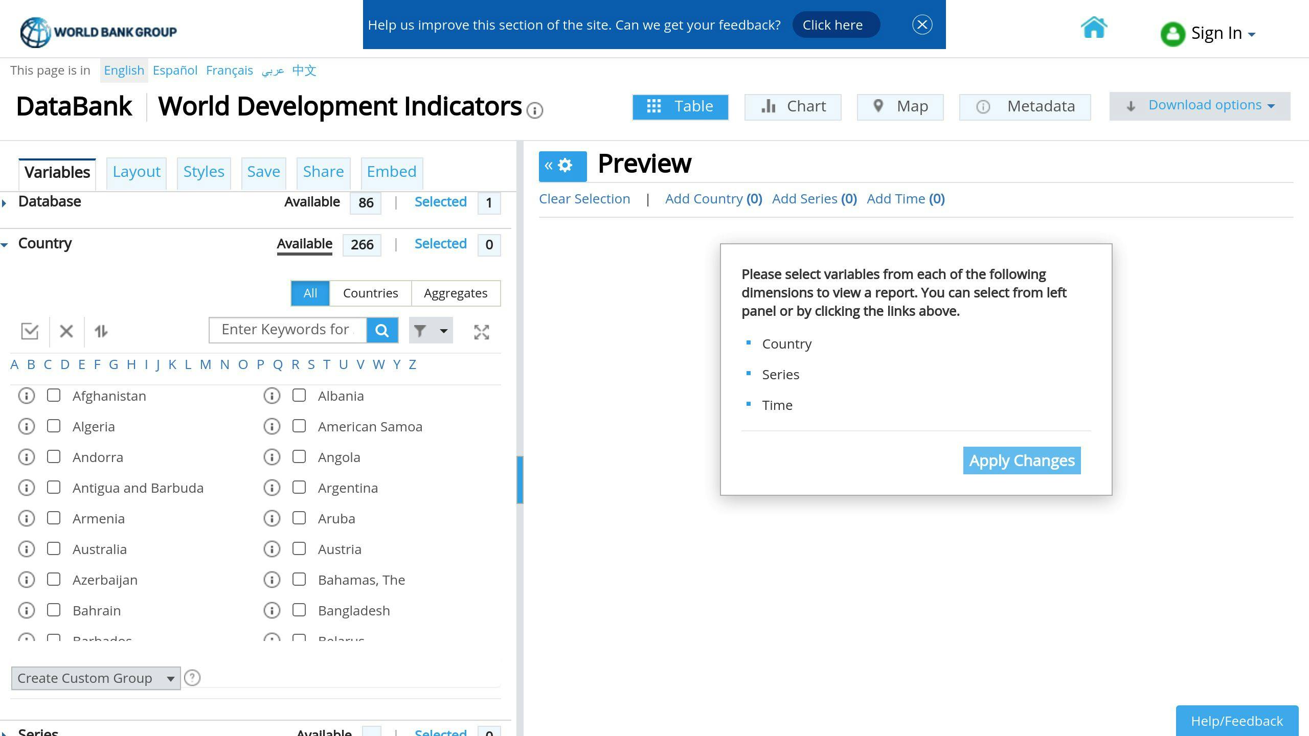
The World Bank Open Data platform is an excellent resource for creating bar chart race visualizations. It provides access to over 3,000 development indicators from more than 200 economies, with time-series data stretching back to 1960 [1]. This makes it perfect for analyzing long-term global trends.
The platform's data comes from trusted sources like national statistical agencies, central banks, and international organizations [1]. Each dataset undergoes thorough validation to ensure both accuracy and consistency.
You can download data in formats such as CSV, Excel, and JSON, making it compatible with most visualization tools. Key areas covered by the platform's indicators include:
- Economic growth
- Population trends
- Health statistics
- Education metrics
- Infrastructure data
For effective bar chart race videos, focus on datasets with consistent historical records, regular updates, and noticeable trends. Metrics like GDP growth, population changes, and health data work particularly well for showcasing dynamic shifts over time.
With its extensive global coverage and historical depth, the World Bank Open Data platform is a great starting point for creating engaging visualizations. Next, let’s take a look at another resource: Our World in Data.
2. Our World in Data
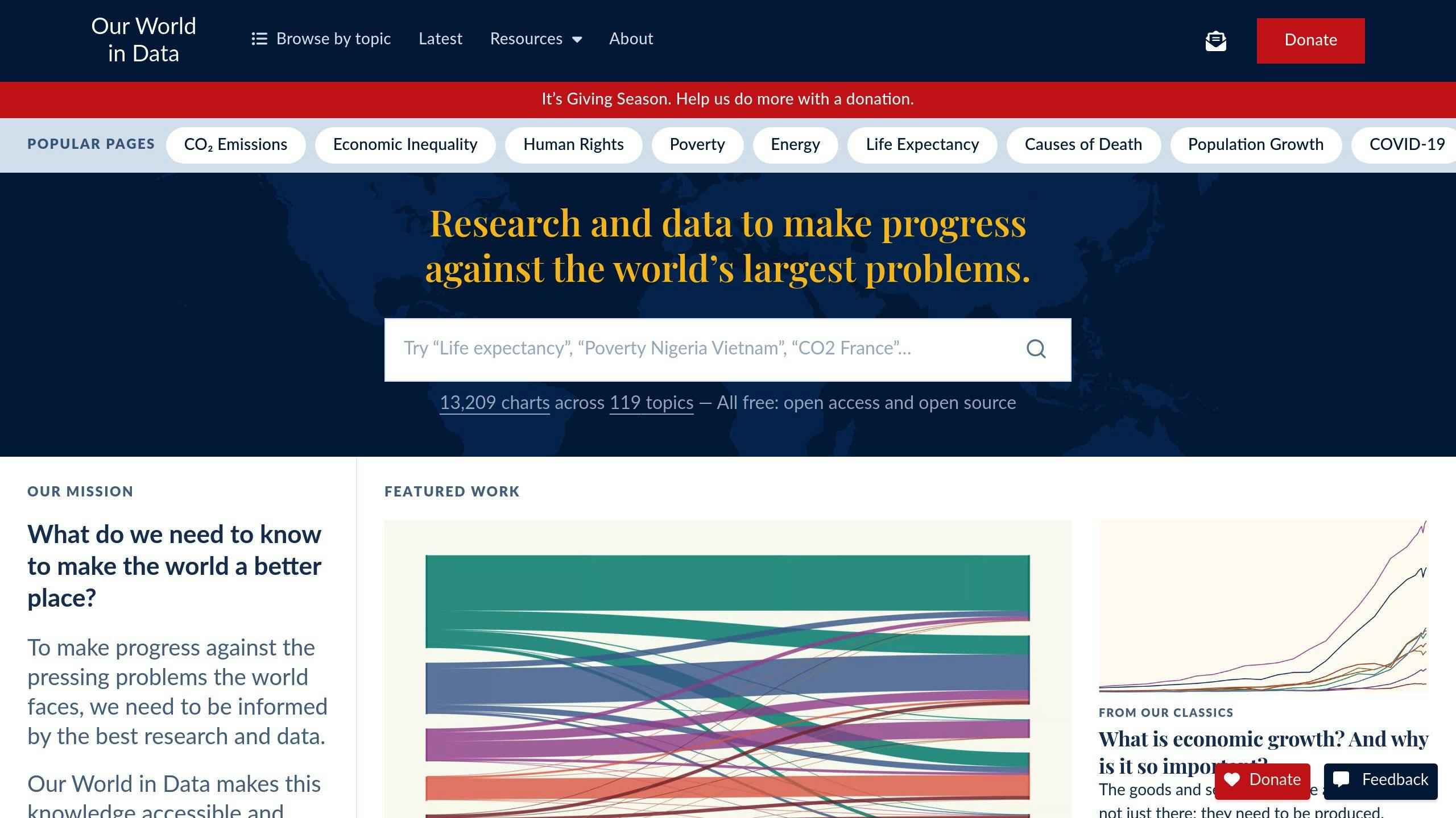
Our World in Data is a go-to platform for creating engaging bar chart race visualizations, thanks to its vast collection of historical datasets. It covers a wide range of topics, including economics, demographics, health, and environmental issues, making it a rich resource for dynamic visual content.
What makes Our World in Data stand out is its strict data validation process. The platform sources its information from well-known global organizations and verifies each dataset thoroughly before publishing. This ensures you’re working with accurate and reliable data for your visualizations.
The platform is also easy to navigate, with a user-friendly interface and flexible export options. These features make it simple to integrate datasets with popular visualization tools like Flourish, Plotly, and Tableau.
One standout example is their CO2 emissions dataset, which spans several decades. It's perfect for illustrating global carbon emission trends in a bar chart race format.
To get the best results, focus on datasets that are well-maintained and show clear trends. The platform’s detailed documentation helps you understand the context and limitations of the data, ensuring your visualizations are both accurate and insightful.
Next, we’ll dive into another excellent resource for global data insights: United Nations Data.
3. United Nations Data
The United Nations Data platform is a treasure trove for creating bar chart races, offering access to over 60 million data points from more than 200 countries and territories. While other platforms like the World Bank and Our World in Data provide broad global data, UN Data's focus on Sustainable Development Goals (SDGs) indicators offers a specialized angle for visualization projects.
What makes UN Data stand out is its emphasis on SDG indicators. This focus allows users to explore global trends like economic changes or shifts in environmental policies. Plus, the datasets are carefully validated, ensuring you can trust the information for your visualizations.
Here’s what the platform offers:
- Detailed metadata and documentation to understand the data better
- Built-in data preview tools to simplify exploration
- Regularly updated datasets from over 60 providers
- Information across 20+ categories
For example, the World Population Prospects dataset provides both historical and projected demographic data, making it perfect for tracking population trends. Similarly, the SDG dataset delivers insights into global development metrics.
When using UN Data, prioritize datasets with consistent reporting periods and minimal gaps. The preview feature can save time during data preparation. To create more engaging visualizations, try combining related indicators - like GDP and environmental data - to tell a richer story about economic growth and its impacts.
With contributions from numerous providers and coverage across diverse categories, UN Data is an excellent resource for crafting visualizations that highlight global development and change.
Next, we’ll take a look at Eurostat, another key platform for regional and global data insights.
4. Eurostat
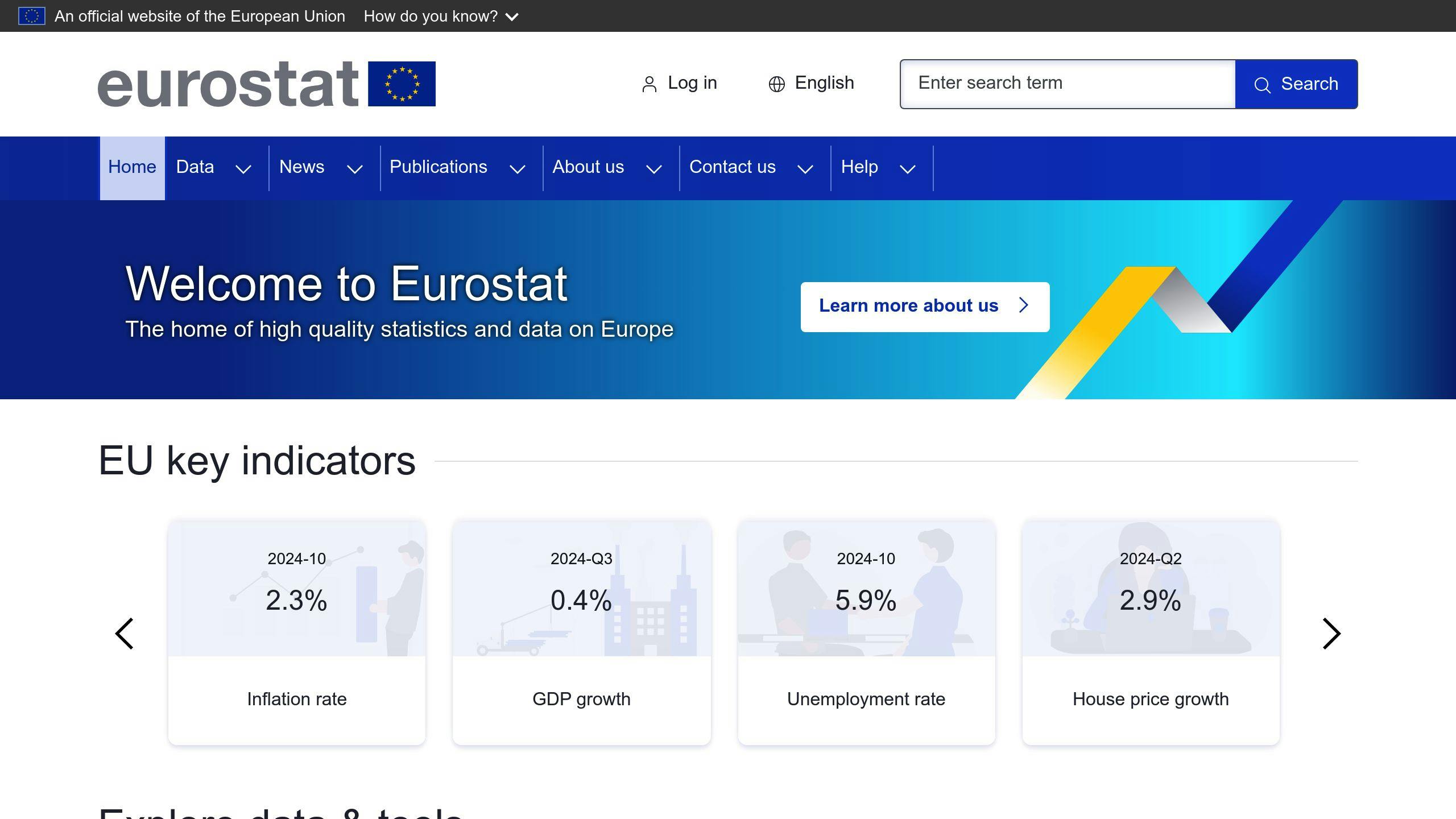
Eurostat, the statistical office of the European Union, is a go-to source for creating bar chart race visualizations centered on European data. It provides a wealth of datasets on topics like the economy, population, health, and energy use across EU member states and neighboring regions.
One of Eurostat's strengths lies in its time-series data, which works seamlessly with tools like Flourish, Power BI, or Python libraries. The data undergoes rigorous validation, ensuring accuracy and dependability for your projects.
For example, Eurostat's renewable energy consumption dataset is perfect for showcasing trends in sustainable energy use across Europe. Its structured datasets and detailed metadata make it easy to create visual stories that track Europe's changing landscape over time.
Here’s why Eurostat is a great choice for bar chart race creators:
| Feature | Benefit for Bar Chart Races |
|---|---|
| Multi-Level Data | Create visualizations at country, regional, or municipal scales |
| Frequent Updates | Use the most current data for your projects |
| Detailed Metadata | Gain insights into the context and limitations of datasets |
| Flexible Formats | Easily integrate data into visualization tools |
To make the most of Eurostat, start by exploring its organized data categories to find what you need. Use the preview feature to check for completeness before downloading. For more dynamic visualizations, try combining datasets, like linking economic growth data with energy metrics, to craft richer narratives about European development.
Eurostat’s user-friendly interface and filtering tools make it simple to navigate. You can focus on specific time periods or regions, ensuring your visualizations are both relevant and clear. For smoother animations, prioritize datasets with consistent reporting periods across all countries.
Next, we’ll look at a platform that offers datasets with a broader, global focus: the US Census Bureau.
5. US Census Bureau
The US Census Bureau is a go-to resource for creating bar chart race visualizations, thanks to its extensive collection of demographic, economic, and social data available through data.census.gov. With consistent updates and a reliable methodology, it’s perfect for crafting dynamic and accurate animations.
What sets the Census Bureau apart is its unmatched focus on U.S. trends. Unlike global platforms, it provides highly detailed data about American demographics and regional differences. For example, its datasets span over 40,000 geographic entities, supported by tools like the American Community Survey (ACS).
Here are some of its key datasets and their visualization potential:
| Dataset Category | Update Frequency | Visualization Potential |
|---|---|---|
| Demographic Estimates | Annual | Track population shifts by state/county |
| Economic Indicators | Monthly/Quarterly | Highlight employment and income trends |
| Housing Statistics | Annual | Show changes in the real estate market |
| Business Dynamics | Every 5 years | Visualize industry growth patterns |
The platform provides user-friendly access, with data available in formats like CSV and Excel. This makes it easy to integrate with visualization tools for smooth workflows.
To make the most of Census data for bar chart races, focus on datasets with complete time series and state-level comparisons. Combining demographic data with economic metrics can create more engaging and informative narratives. The decennial census offers comprehensive benchmarks, while intercensal estimates provide detailed data for fluid animations.
If you’re working on visualizing business and industry trends, the Economic Census (updated every five years) is a great resource. It offers in-depth insights into regional economic changes, perfect for creating compelling visualizations.
For broader or more specialized datasets, you might also explore platforms like Kaggle, which provide additional options and variety.
6. Kaggle Datasets
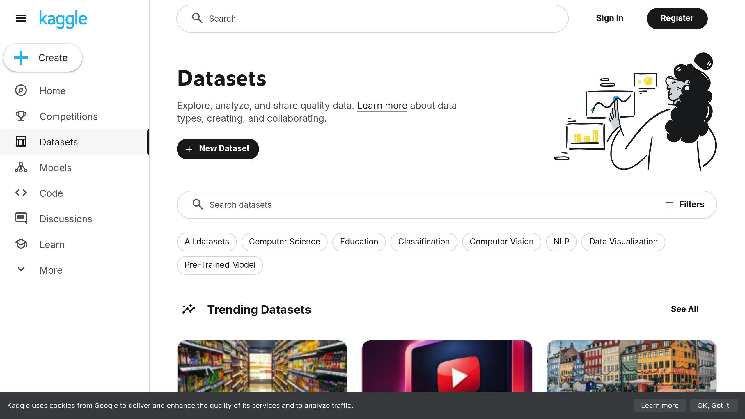
Kaggle offers thousands of datasets spanning categories like economics, health, and the environment, making it a go-to platform for creating dynamic visualizations. Its community-driven approach ensures access to a wide range of validated datasets. Plus, its compatibility with tools like Flourish, Plotly, and Tableau makes creating bar chart races much easier.
Here’s a quick look at some of Kaggle’s key dataset categories:
| Category | Update Frequency | Visualization Examples |
|---|---|---|
| Economic Indicators | Monthly/Quarterly | Country-level comparisons |
| Health Statistics | Annual | Disease trends |
| Environmental Data | Monthly | Climate change impacts |
| Social Metrics | Quarterly | Population shifts |
A standout example is the "World Development Indicators" dataset. It provides historical data across various countries and metrics, making it perfect for region-specific and customizable visualizations.
When working with Kaggle datasets, focus on those with consistent time series and detailed metadata for smooth visualizations. Kaggle’s exploration tools can help you spot gaps or inconsistencies before downloading. Additionally, its update tracking system ensures you’re working with the most accurate data, especially for ongoing projects.
Kaggle also offers forums and shared workflows where users can exchange tips and strategies, making it beginner-friendly. With its vast dataset library and active community, Kaggle is an excellent choice for creating bar chart races.
Next, we’ll dive into Google Dataset Search, another powerful resource for finding datasets across various fields.
7. Google Dataset Search
Google Dataset Search is a search engine designed to help users find datasets from reliable sources like government databases, academic institutions, and research organizations. It's a go-to tool for anyone working on data-driven projects, including creating engaging bar chart races.
The platform's interface makes it simple to locate time-series data. With features like format filters and verified sources, it ensures you can quickly access datasets that are both credible and easy to use.
| Feature | How It Helps with Bar Chart Races |
|---|---|
| Format Filters | Lets you pick CSV or Excel files for easy import |
| Source Verification | Confirms dataset origin and trustworthiness |
| Update Tracking | Shows when the data was last refreshed |
| Metadata Access | Provides details on how the data was collected |
What to Look for in a Dataset:
- Temporal Coverage: Choose datasets that span several years or even decades.
- Regular Updates: Opt for sources that update their data consistently.
- Standardized Format: Stick to well-organized files like CSV or Excel for smoother processing.
Google Dataset Search uses machine learning to improve search relevance, helping you find the most contextually accurate datasets. Searching for something specific? Use precise terms like "annual population by country 1950-2020" to get targeted results. You can also filter results by date range, file format, and source reliability.
For example, the "Global Brand Values" dataset, which tracks brand value trends from 2000 to 2024, is perfect for visualizing long-term changes. The metadata included with search results ensures the data is high-quality and reliable.
What makes Google Dataset Search stand out is its ability to pull together datasets from a wide range of sources. This saves you time and effort when looking for specialized or hard-to-find data, especially for time-series projects.
Next, we’ll take a closer look at Data.gov, another excellent resource for finding datasets to create compelling bar chart race videos.
8. Data.gov
Data.gov is the U.S. government's open data portal, offering a wealth of datasets ideal for creating bar chart race visualizations. With verified data from various federal agencies, it’s a dependable resource for building dynamic and engaging animations.
The platform provides a wide range of U.S. statistics, including:
- Economic metrics like GDP and employment rates
- Energy and environment data such as renewable energy production
- Demographic trends like population changes
- Public health statistics such as disease prevalence
Datasets are available in formats like CSV, JSON, and XML, making them compatible with most visualization tools. One of Data.gov's key advantages is its long-term, consistently gathered data, which is perfect for tracking trends over time.
When selecting datasets for bar chart races, prioritize those with:
- Complete time series data
- Regular updates
- Clear and detailed documentation
- Consistent measurement methods
For example, the renewable energy production dataset is particularly well-suited for bar chart races. Its clean and consistent data points translate seamlessly into dynamic visualizations. Advanced search tools make it easy to find time-series data, and built-in previews let you quickly assess the quality of the information.
For larger or recurring projects, Data.gov also provides API access, allowing for automated updates to keep visualizations current. This feature is especially useful for creators managing ongoing bar chart race projects.
Although Data.gov primarily focuses on U.S. datasets, you can combine its resources with international data sources to create global comparisons. Up next, we’ll look at OECD Data, which provides insights into worldwide economic and social trends.
9. OECD Data
The OECD Data Portal is a go-to source for time-series datasets, perfect for creating bar chart race visualizations. It focuses on economic, social, and other key trends like GDP, employment rates, CO2 emissions, education, and healthcare statistics.
What sets the OECD apart is its focus on member countries, ensuring consistent and reliable data for international comparisons. The datasets follow global statistical standards and are validated in collaboration with national statistical offices. This makes them highly dependable for producing accurate and smooth visualizations.
The portal provides data in formats like CSV and Excel, which work seamlessly with tools such as Flourish and Power BI. Each dataset comes with detailed metadata to help you understand its context and any limitations.
Here are a few tips when working with OECD data:
- Data completeness: Look for datasets with consistent historical records.
- Update frequency: Use regularly updated indicators for projects that need ongoing data.
- Cross-country comparability: Stick to metrics standardized across nations for reliable comparisons.
For example, the renewable energy dataset, updated quarterly, is ideal for visualizing trends in clean energy adoption across member countries. The platform even includes built-in tools to evaluate data before downloading.
Although the OECD primarily focuses on member countries, it also includes data for partner regions, enabling broader international analyses when combined with other sources.
For health-related data, consider using the World Health Organization (WHO) as a complementary resource. It offers detailed insights into global health trends, which can enhance your bar chart race projects.
10. World Health Organization (WHO) Data
The WHO's Global Health Observatory (GHO) is a go-to platform for global health statistics, offering over 1,000 indicators such as life expectancy, disease rates, and healthcare system performance. With standardized formats, thorough validation, and frequent updates, this data is perfect for creating visualizations like bar chart races that showcase global health trends.
The platform includes datasets on key health metrics, such as:
- Life expectancy changes
- Disease rates and patterns
- Healthcare system resources
- Population health statistics
- Mortality data
Tips for Making the Most of WHO Data
- Pick the Right Data: Focus on indicators with consistent historical data and regular updates. For instance, the global immunization coverage dataset (1980-2024) works well for smooth, time-based animations.
- Ensure Data Quality: WHO data undergoes a rigorous validation process, including collaboration with member states and international organizations, ensuring high accuracy in health-related statistics.
The WHO Data Portal makes visualization easier with preview features, detailed metadata, and multiple export options. For example, the COVID-19 vaccination tracker dataset effectively highlights global vaccination progress.
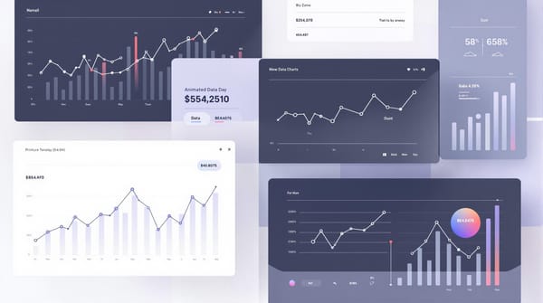
No-Code Tools for Creating Bar Chart Races
Making bar chart race visualizations is now easier than ever, thanks to no-code tools. These platforms let you turn static data into animated, interactive visuals - no coding required.
Popular No-Code Platforms
Flourish stands out as a top choice for creating bar chart races. It simplifies the process of turning time-series data into polished animations. It's great for showcasing trends like GDP growth, population shifts, or market changes, all through an easy-to-use interface.
Alien Art Charts is another solid option. It offers both free and paid plans, making it accessible for users with different needs.
| Feature | Flourish | Alien Art |
|---|---|---|
| Free Plan | Yes | Yes |
| Video Export | Yes | Yes |
| Data Format Support | CSV, Excel | CSV, Excel |
Tips for Better No-Code Visualizations
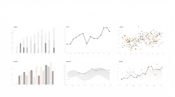
To create effective and engaging bar chart races, make sure your data is well-organized. Include clear labels and arrange time-series values in the correct columns. Use time intervals that highlight key trends while keeping transitions smooth. Also, pay attention to visual details like bar scaling and heights to ensure all data remains visible and easy to interpret throughout the animation.
What These Tools Can Do
Modern no-code tools now include features that used to require programming skills. For example, Flourish offers:
- Adjustable animation speeds
- Caption overlays for added context
- Export options in various formats
These tools are perfect for visualizing datasets like GDP statistics from the World Bank or health data from WHO. They allow you to turn reliable data into dynamic animations that make your insights stand out.
Wrapping Up
Creating bar chart race videos has never been easier, thanks to no-code tools and reliable data sources. Platforms like Flourish and datasets from organizations such as the World Bank and WHO make it simple to turn raw numbers into dynamic visualizations.
Each data source has its strengths. The World Bank provides a wealth of economic indicators, while the WHO offers detailed health statistics. Their consistent formatting and frequent updates ensure your visualizations are accurate and smooth.
| Data Source | Ideal For |
|---|---|
| World Bank Open Data | Economic Trends |
| WHO Data | Health Statistics |
| OECD Data | Development Metrics |
Flourish stands out for its user-friendly interface and powerful features. When paired with the right datasets, it allows you to create visualizations that tell compelling stories. Whether you're showcasing population shifts, economic developments, or health data, focus on crafting clear and engaging narratives while maintaining the integrity of your data.
With these tools and resources, the world of data visualization is more accessible than ever. Dive in, explore the platforms, and start creating visual stories that captivate and inform your audience.
FAQs
How do you visualize historical data?
Bar chart races are a dynamic way to display historical trends over time. To create effective visualizations, start by choosing datasets with regular time intervals and noticeable trends. Tools like Flourish work well for smaller datasets, while D3.js is better suited for larger or more detailed ones.
When working with historical data from sources like the World Bank or WHO, focus on these steps:
- Prepare Your Data: Organize and clean your data in chronological order. Match the tool you use to the size and complexity of your dataset.
- Pick the Right Chart: Bar charts and line graphs are ideal for showing changes over time in a clear and engaging way.
- Keep It Clear: Limit comparisons to 8-10 categories to maintain readability, and use consistent formatting to avoid confusion.
For example, the WHO's global immunization coverage dataset (1980-2024) provides a reliable and well-structured historical record, making it perfect for creating dynamic visualizations like bar chart races.
To make your visualization both informative and engaging, add historical context and ensure labels are clear throughout the animation. This helps viewers grasp the importance of the trends while keeping their attention.