Combining Bar and Line Chart Races Using Alien Art Charts: A Comprehensive Tutorial
How to combine Bar Chart Race and Line Chart Race?
In this extensive tutorial, we will explore how to effectively combine a Bar Chart Race and a Line Chart Race in a single project using Alien Art Charts. Our primary focus will be on tracking the subscriber count history of two of the most prominent YouTubers: PewDiePie and MrBeast. This type of project is typically available only in the paid version of the platform. However, there is a unique link in the description that grants one month of free access to all project types.
The aim of this tutorial is to guide you through the step-by-step process of creating a captivating Subscriber Count Battle of YouTubers. By the end, you’ll be equipped with the knowledge to visualize YouTube statistics effectively.
How to combine bar chart race and line chart race via Alien Art Charts?
Step 1: Setting Up Your Alien Art Account
To get started, navigate to alienart.io and sign up for an account if you haven’t done so already. If you already have an account, simply log in.
After signing in, you will find a user-friendly interface that allows you to access various features of Alien Art. To create your project, locate and click on the Statistics button in the top-right corner of the interface. This will initiate the process of creating your project.
Why Use Alien Art Charts?
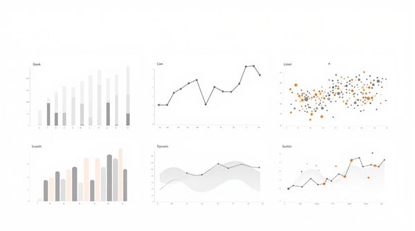
Before diving into the project, it's worth mentioning why Alien Art Charts is an excellent choice for visualizing YouTube data. The platform provides intuitive tools for creating dynamic visualizations, allowing you to present complex data in an easily digestible format. Its ability to combine different chart types, such as Bar Chart Races and Line Chart Races, gives you versatility in how you display your findings.AlienArt.io offers its users access to a wealth of statistical data, allowing them to track the subscriber count history of various famous YouTube channels over time. This feature enables a deeper understanding of channel growth trends and audience engagement. It is located in the Statistics section, enabling a deeper understanding of channel growth trends and audience engagement.
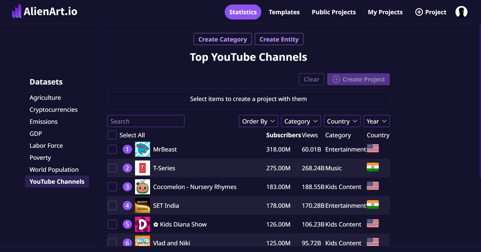
Step 2: Selecting YouTube Channels
Scroll through the list of top YouTube channels until you find PewDiePie and MrBeast. These two channels will serve as our focus for this project. Although we have chosen these specific channels, feel free to select any channels that interest you for your analysis.
Understanding PewDiePie and MrBeast
PewDiePie, known for his gaming content, commentary, and vlogs, has been a staple of YouTube for over a decade. His subscriber count has fluctuated significantly, often resulting in dramatic "subscriber wars," especially with MrBeast.
MrBeast, on the other hand, has gained fame for his extravagant challenges, philanthropy, and unique video concepts that capture audience attention. By comparing their subscriber counts, we can gain insights into their popularity and how content strategies impact growth.
Once you have selected your desired channels, click the Create Project button to initiate the setup for your Bar and Line Chart Race.
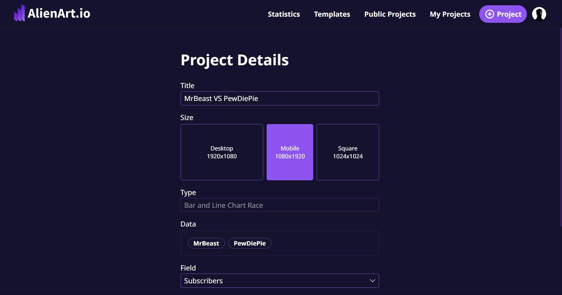
Step 3: Naming Your Project
Next, it’s important to give your project a fitting title. Since our project revolves around the subscriber count history of PewDiePie and MrBeast, we will title it: “PewDiePie vs MrBeast Subscriber Count”.
The Importance of a Clear Title
A clear and engaging title not only helps clarify the focus of your project but also attracts viewers. When sharing your charts, an informative title enhances understanding and encourages viewers to engage with your content.
Step 4: Configuring the Chart Orientation
Alien Art Charts provides various orientation options for the chart. For this particular project, we’ll choose the Portrait orientation, which is ideal for mobile format videos. This ensures that your visuals will be optimized for mobile viewers, enhancing user experience.
Choosing the Right Orientation
Selecting the right orientation is crucial for ensuring your charts are visually appealing and easy to read. Portrait orientation often works better for content designed for social media sharing, as it fits well within mobile screens, making it more accessible to a broader audience.
Step 5: Choosing Your Data Fields
In addition to tracking subscriber counts, we also have the option to track total views, which offers a broader perspective on YouTuber history. By default, the Subscribers option is selected under the Field option, and since this aligns with our project goals, we will leave it unchanged.
The Significance of Subscriber Counts
Subscriber counts serve as a vital indicator of a YouTuber's popularity and influence. High subscriber counts typically correlate with higher engagement and broader reach, which can lead to increased revenue opportunities and brand partnerships. By tracking this data, we can analyze growth trends and understand viewer preferences.
Next, we can determine how we want to estimate the subscriber count history. The options available include annual or monthly data. For our project, we will select Monthly from the Period option, as it provides a more granular view of subscriber trends.
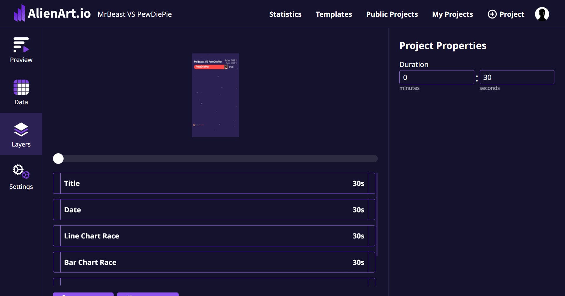
On the right side of the screen, confirm that the project type is set to Bar and Line Chart Race—this feature is available in the Pro version of the site. Once all configurations are set, click the Create button under the chart types to proceed.
Step 6: Previewing and Customizing the Chart
Now that you’ve created the project, it’s time to preview the chart and customize its design to enhance its professional appearance. The default data for the chart typically goes back to 2014. However, our focus is on the period after 2019, so we will adjust the data accordingly.
Reviewing Default Data
Before modifying the data range, take a moment to review the default data presented. Understanding the historical context can provide insights into patterns and shifts in subscriber behavior over time. This context is crucial for interpreting the resulting charts accurately.
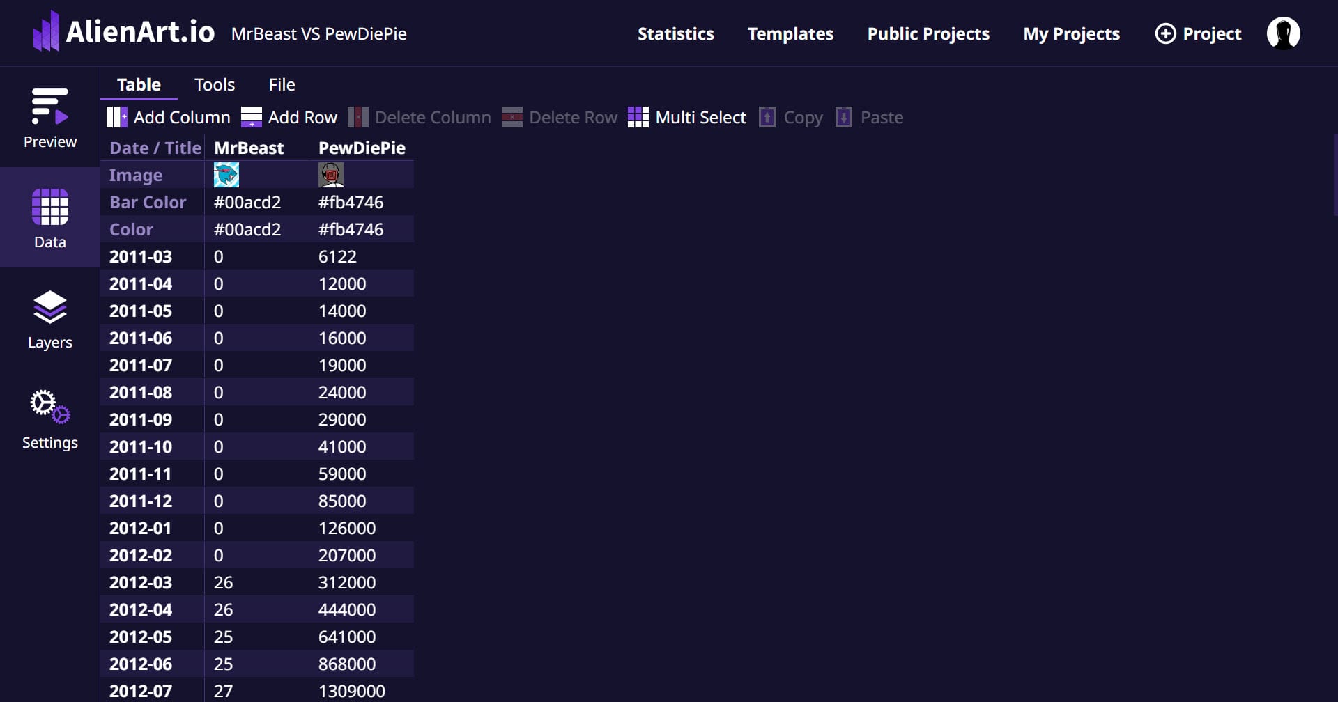
To modify the date range, click on the Data tab on the left side of the screen, just below the Preview button. Here, you can select the data rows corresponding to the years 2014 to 2019 and then click on the Delete Row button located in the Table section. This ensures our chart only reflects the relevant data for our Subscriber Count History Battle of the YouTubers.
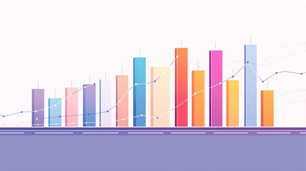
Step 7: Customizing the Bar Chart Race
To enhance the visual appeal of the Bar Chart Race section, navigate to the Layers tab and select Bar Chart Race. On the right side of the screen, you will find the Items section where you can make various adjustments.
Icon Shape Customization
One of the first customizations we will make is changing the shape of the icon from square to circle. This alteration helps the icons fit better within the circular format of the Bar Chart Race, making the presentation more aesthetically pleasing.
Activating Custom Bar Colors
Next, we will activate the Custom Bar Colors option. By doing this, a new column will be added to the data tab, which we will utilize later to select specific colors for each YouTuber's bar. Choosing appropriate colors enhances not only the aesthetics but also the clarity of the chart.
Custom Shapes and Icons
Consider customizing shapes further, perhaps by using different icons that represent each YouTuber's brand. This can enhance viewer engagement by providing a visual connection to the content they produce. Using recognizable symbols related to each YouTuber can make your charts more relatable.
Adding Animations
Many viewers appreciate dynamic visual presentations. If Alien Art Charts offers animation options, consider incorporating subtle animations that make your Bar Chart Race more engaging. Animations can help illustrate changes over time and keep your audience's attention.
Step 8: Customizing the Line Chart Race
After customizing the Bar Chart Race section, we need to move on to the Line Chart Race. Click on the Line Chart Race button located beneath the Bar Chart Race section in the Layers tab.
Adjusting Line Height
The default height of the Line Chart Race section is relatively short, which may obscure some visual details. To make the increase in subscriber counts more visible, we will adjust the height. Click on the Position and Size button on the right side of the screen and change the Height value from the default to 1300. This adjustment ensures that the top limit of the Line Chart Race section is well-positioned beneath the Bar Chart Race section, providing ample space without overlapping.
Enhancing Line Visibility
Consider adjusting the Line Height and Line Speed as well to make trends easier to observe. Increasing line visibility can significantly enhance your audience's understanding of subscriber growth patterns over time.
Adding Data Points
In some scenarios, adding specific data points on the line chart can further enhance understanding. For instance, you might want to highlight notable events such as major video releases or collaborations that resulted in spikes in subscriber counts.
Step 9: Selecting Color Schemes
The final step in completing our chart involves selecting appropriate color schemes that represent each YouTuber distinctly. To do this, navigate to the Data tab and locate the section beneath the YouTuber logos where you can configure the Color and Bar Color options.
Choosing Colors
By clicking on the line located on the right side of the screen, a color palette will appear, allowing you to select your desired color scheme. If you have specific color codes that you wish to use, you can input them directly into the provided field.
The Importance of Color in Data Visualization
Color plays a vital role in data visualization. It can evoke emotions, guide viewers’ attention, and differentiate data sets effectively. For our example, we’ll select color codes that correspond with PewDiePie’s and MrBeast’s logos, enhancing the chart's overall visual coherence.
Final Review of Color Choices
Once you've selected the colors, it’s essential to conduct a final review of your project. Make sure that each color choice aligns well with the branding of the YouTubers, ensuring that the visual representation is not only attractive but also informative. Consistency in color schemes can significantly enhance brand recognition and make the charts more relatable to viewers.
Step 10: Previewing and Finalizing Your Project
After making all the necessary adjustments, it’s time to preview your project one last time. Click on the Preview button to see how your combined Bar and Line Chart Race looks.
Making Final Adjustments
As you preview your project, pay attention to any elements that might need tweaking. Check for any overlapping text, unclear labels, or color choices that may not be easily distinguishable. Remember, the goal is to create a clear and engaging visualization that effectively communicates the subscriber count history.
Collecting Feedback
Before finalizing your project, it can be beneficial to collect feedback from peers or potential viewers. Sharing a draft version of your charts with a small audience can provide insights that you might have overlooked. Consider their suggestions regarding clarity, aesthetics, and overall impact.
Step 11: Saving and Sharing Your Project
Once you're satisfied with your project, it's time to save and share it. Click on the Save button, ensuring that your work is not lost. After saving, you will be provided with options for sharing your project.
Exporting Your Charts
Many platforms, including Alien Art Charts, allow you to export your visuals in various formats. This feature is valuable if you plan to share your charts on social media or include them in presentations. Common export formats include JPEG, PNG, and sometimes even video formats, which can animate the charts over time.
Promoting Your Project
To maximize your project's reach, consider promoting it across your social media channels. Craft engaging posts that explain what your charts represent and invite your audience to explore the data. Using relevant hashtags can help increase visibility and attract viewers interested in YouTube statistics.
Step 12: Analyzing the Data
After sharing your project, take some time to analyze the data presented in your charts. This step is crucial for understanding trends and patterns in subscriber growth.
Identifying Key Trends
While reviewing the charts, look for notable trends such as sudden spikes or drops in subscriber counts. Analyze the data in relation to significant events, such as viral videos, collaborations, or changes in content strategy. This analysis can help you understand the factors that influence subscriber behavior.
Learning from Competitors
By studying the subscriber count history of PewDiePie and MrBeast, you can glean insights into effective content strategies. Consider what types of videos resonate most with audiences and how these creators have leveraged their popularity. This information can be invaluable if you are looking to grow your own YouTube channel.
Step 13: Exploring Further Customization Options
Alien Art Charts offers a range of customization options that can elevate your visualizations even further. After you have created your initial charts, consider experimenting with additional features to enhance your project.
Incorporating Interactive Elements
If the platform allows, consider adding interactive elements to your charts. Interactive features can engage viewers and allow them to explore the data at their own pace. For instance, tooltips can provide additional context when viewers hover over specific data points.
Adding Annotations
Annotations can be a powerful tool for providing context within your charts. By adding notes or highlights for key events, you can help viewers understand the reasons behind significant changes in subscriber counts. This contextual information enriches the viewer's experience.
Step 14: Keeping Your Data Updated
As YouTube continues to evolve, so do the statistics related to popular channels. To maintain the relevance of your project, consider updating your charts regularly.
Setting a Schedule for Updates
Establish a schedule for updating your charts, whether it’s monthly, quarterly, or bi-annually. Regular updates will keep your data fresh and ensure that viewers always have access to the most current information.
Utilizing New Features
Stay informed about any new features or updates that Alien Art Charts may introduce. New tools can enhance your ability to present data and may offer additional visualization options that can improve your project.
Conclusion
In this comprehensive tutorial, we have walked through the process of creating a combined Bar and Line Chart Race project using Alien Art Charts. By tracking the subscriber count history of PewDiePie and MrBeast, we not only visualized key statistics but also gained valuable insights into their popularity and the factors influencing subscriber behavior.
By following the steps outlined in this tutorial, you now possess the skills necessary to create engaging visualizations that effectively communicate important data. Whether you are a content creator, a data analyst, or simply an enthusiast, the ability to present statistics in an appealing format is a valuable asset.
Final Thoughts
We encourage you to explore further with Alien Art Charts. As you become more familiar with the platform, don't hesitate to experiment with different datasets, chart types, and customization options. The world of data visualization is vast, and there are endless possibilities for creative expression and informative storytelling.
Thank you for following along in this tutorial. If you enjoyed it, please like and subscribe for more tutorials and insights on using data visualization tools effectively!
Moreover, consider using your skills to tackle various topics beyond YouTube statistics. From tracking social media trends to analyzing sales data, the techniques you’ve learned can be applied across multiple domains. By continuously honing your data visualization abilities, you can transform complex datasets into compelling narratives that resonate with your audience. Thank you for following along in this tutorial. If you enjoyed it, please like and subscribe for more tutorials and insights on using data visualization tools effectively!
This should provide a more robust conclusion while reinforcing the tutorial's key points and encouraging further exploration. If you need any other changes, just let me know!