Best Chart Types for Visual Storytelling
Explore the best chart types for visual storytelling, including bar charts, line charts, scatter plots, and animated chart races.
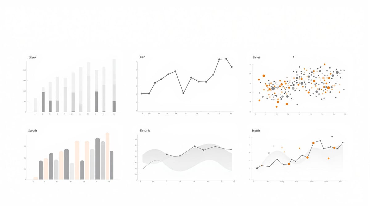
Want to make your data easy to understand and engaging? Choosing the right chart type is key. Here’s a quick guide to the four most effective chart types for visual storytelling:
- Bar Charts: Best for comparing values across categories (e.g., survey results, market share).
- Line Charts: Perfect for showing trends and changes over time (e.g., stock prices, traffic growth).
- Scatter Plots: Ideal for uncovering relationships between two variables (e.g., marketing spend vs. sales).
- Animated Chart Races: Adds movement highlighting rankings and progression over time (e.g., brand growth, demographic shifts).
Each chart type has its strengths and works best for specific data stories. Keep reading to learn when and how to use them effectively, plus tips for creating clear and impactful visuals.
Related video from YouTube
1. Bar Charts: When and Why to Use Them
Bar charts are great for comparing values across categories. They make size differences easy to spot and are perfect for turning data into a story that’s simple to understand.
Best Use Cases
Bar charts work well for comparing categories and showing rankings. They’re especially helpful for:
- Comparing performance metrics across teams or departments
- Showing survey results with multiple response options
- Highlighting market share among competitors
- Breaking down budget allocation across various projects
By focusing on category differences, bar charts make data easier to grasp and leave a lasting impression.
Types and Applications
Bar charts come in several formats, each suited for specific needs:
| Bar Chart Type | Best For | Key Advantage |
|---|---|---|
| Simple Bars | Comparing a single category | Easy to interpret |
| Grouped Bars | Comparing multiple categories | Side-by-side comparisons |
| Stacked Bars | Showing part-to-whole data | Highlights composition |
| Horizontal Bars | Long category names | Improves label readability |
Implementation Guidelines
Modern tools like Power BI, Excel, and Alien Art make designing bar charts simple, offering templates and even video export options. To create effective bar charts, focus on:
- Clear, easy-to-read labels
- Proper spacing between bars
- Consistent color schemes for clarity
- Accurate scales to avoid misleading visuals
Bar charts are straightforward and accessible, making them a great choice for audiences with varying levels of data expertise. However, if your goal is to show trends over time, line charts might be a better fit.
2. Line Charts: Tracking Trends Over Time
Line charts are perfect for showing how things change over time. They make it easy to spot trends and patterns in time-based data, breaking down even complicated information into something more understandable. Their clean, straightforward design makes them a go-to choice for time-focused insights.
Best Use Cases
Line charts are ideal for tracking changes over time, especially for data like:
- Stock market ups and downs
- Population growth
- Economic trends
- Website traffic
For instance, if you want to show the rise in global electricity access, a line chart can clearly highlight the progress over the years [5].
How They Engage Your Audience
Line charts lead viewers through the story behind the data, emphasizing key elements like:
| Element | What It Highlights |
|---|---|
| Peaks | The highest points or moments of success |
| Troughs | Areas that show challenges or setbacks |
| Slopes | The speed or direction of changes |
| Intersections | Points where data sets overlap or cross |
These features make it easy to pinpoint moments that matter most in your data.
Keeping It Clear and Simple
Line charts work best when they’re not overloaded with information. To keep them effective:
- Stick to 3-4 lines per chart for easy comparison
- Use distinct colors to separate data series
- Add markers to emphasize important points
- Include annotations to explain significant events [3]
Tools to Create Line Charts
Creating line charts is easier than ever with tools like Alien Art's platform. Features include:
- Ready-made templates for quick chart creation
- Video export for dynamic presentations
- The ability to merge multiple charts into one
- No coding required for customization
For more complex stories, consider pairing line charts with other visuals. For example, while line charts are great for trends, scatter plots can better show relationships between variables - something we’ll dive into next.
3. Scatter Plots: Showing Relationships Between Variables
Scatter plots are perfect for visualizing how two variables relate to each other. Unlike line charts, which focus on trends over time, scatter plots let you see interactions and patterns between variables at a glance.
Best Use Cases
Scatter plots are ideal for exploring correlations in various contexts, such as:
| Data Type | Example Application |
|---|---|
| Market Research | Customer satisfaction vs. product features |
| Scientific Studies | Temperature vs. humidity patterns |
| Business Analytics | Age demographics vs. purchase amounts |
| Performance Metrics | Marketing spend vs. conversion rates |
Why They Work
Scatter plots simplify complex relationships by:
- Highlighting patterns: Grouping similar data points visually makes trends easy to spot.
- Spotting outliers: Outliers stand out, signaling areas for further investigation.
- Showing correlation strength: The spread of points illustrates how closely variables are connected.
- Interactive exploration: Features like hover-over details let users dive deeper into specific data points.
Adding clear labels and hover-over text ensures your audience can quickly understand the story behind the data.
Tips for Managing Complex Data
To make your scatter plots clear and effective:
- Use colors and point sizes to differentiate categories or variables.
- Apply transparency or slightly shift overlapping points to reduce clutter.
- Enable interactive filtering for large datasets, letting users focus on specific details.
- Add trend lines to emphasize key relationships.
Tools to Create Scatter Plots
Here are some popular tools for building scatter plots:
| Tool | Key Features |
|---|---|
| Tableau | Interactive filtering, custom tooltips |
| Power BI | Real-time data connection, drill-through options |
| Python (Matplotlib) | Customizable styling, automation capabilities |
| Excel | Easy to use, widely accessible |
When choosing a tool, think about your audience and the complexity of your data. The right tool ensures your scatter plot is both professional-looking and easy to understand.
The best scatter plots keep things simple. Focus on the key relationship you want to highlight, and avoid cluttering the chart with unnecessary elements. While scatter plots are excellent for revealing relationships, other techniques, like animated chart races, can add even more energy and engagement to your storytelling.
sbb-itb-d373261
4. Animated Chart Races: Adding Motion to Data Stories
Animated chart races visually highlight changes in rankings and values over time. This approach adds movement to data, making it easier to understand and more engaging for viewers.
Best Use Cases
Animated chart races work well in various scenarios:
| Scenario | Application |
|---|---|
| Market Share Evolution | Show how brand rankings evolve over time |
| Population Demographics | Track shifts in city populations |
| Social Media Metrics | Compare follower growth across platforms |
| Economic Performance | Visualize competition between businesses or sectors |
Audience Engagement
These charts grab attention by creating a sense of movement and competition. They simplify complex datasets, turning numbers into a visual story that's easier to follow and remember.
To make the most of animated chart races:
- Use consistent colors and clear labels for better tracking.
- Keep the animation speed manageable (around 2–3 seconds per frame).
- Add annotations to highlight important moments or changes.
Managing Complexity
While animated chart races can handle large datasets, their effectiveness depends on thoughtful design. Here’s how to keep them clear and impactful:
| Challenge | Solution |
|---|---|
| Data Structure | Limit the number of elements and use consistent time intervals |
| Visual Clarity | Ensure smooth transitions between frames |
| Reference Points | Keep key markers visible throughout the animation |
Tools for Creation
Several platforms make it easy to create animated chart races:
AlienArt.io: Combines animation with static visuals, offering features like:
- No-code creation
- Pre-designed templates
- Video export options
- Interactive visualizations
Flourish: Known for its user-friendly templates, Flourish is a go-to for creating polished chart races. It’s particularly popular with news outlets.
Power BI: Ideal for business users, this tool includes:
- Real-time data integration
- Custom animation controls
- Interactive filtering
- Enterprise-level sharing options
The right tool depends on your data and audience. Animated chart races are a great way to captivate viewers, but their success lies in balancing creativity with clarity.
Strengths and Weaknesses of Each Chart Type
Choosing the right chart type is key to crafting a clear and engaging visual story. Each type has its own strengths and limitations, making them suitable for specific uses.
| Chart Type | Advantages | Drawbacks | Best Uses |
|---|---|---|---|
| Bar Charts | • Easy to compare categories • Simple to rank items • Highlights proportions |
• Gets messy with too many categories • Not ideal for continuous data |
• Comparing products • Survey results • Budget breakdowns |
| Line Charts | • Great for showing trends • Highlights patterns over time • Maintains data flow |
• Requires evenly spaced data points • Limited for categorical data |
• Tracking market trends • Showing growth • Measuring performance |
| Scatter Plots | • Shows relationships between variables • Helps spot outliers • Reveals clusters in data |
• Can be overwhelming with large datasets • Harder to interpret for some audiences |
• Analyzing price vs. demand • Studying correlations • Examining distributions |
| Animated Chart Races | • Eye-catching and dynamic • Highlights ranking changes over time • Shows progression clearly |
• Can distract from key details • Timing can affect clarity • Not ideal for static analysis |
• Tracking market share • Visualizing social metrics • Showing demographic changes |
Combining Chart Types
Using multiple chart types together can paint a fuller picture. For instance:
- Pair scatter plots with line charts to show both relationships and trends.
- Use bar charts alongside animated races for both static and dynamic insights.
- Layer different visuals to uncover various angles of a complex dataset.
Modern tools like Alien Art Charts make mixing and matching these approaches easier, reducing the weaknesses of individual chart types.
Tips for Choosing the Right Chart
To make your visualizations impactful, tailor your chart choice to your data and audience. Think about:
- The complexity and structure of your data
- What you want to communicate
- How familiar your audience is with interpreting charts
Final Thoughts
Each chart type has its strengths and challenges, and understanding these is key to creating clear and engaging visual stories.
Today's tools make data visualization easier than ever. Many platforms offer pre-designed templates that help you craft polished visuals, from bar chart races to line chart races, with minimal effort.
When deciding which chart to use, keep these tips in mind:
- Time-Based Trends: Use line charts to show changes or progress over time. They make it easier for viewers to see patterns and understand how things evolve [4].
- Comparisons Across Categories: Bar charts are the go-to for comparing groups or categories. They adapt to various storytelling needs, whether horizontal, vertical, or stacked [1].
- Highlighting Relationships: Scatter plots show connections or patterns between variables. While they might need more explanation for broader audiences, they excel at displaying complex data relationships [2].
- Interactive Rankings: Animated chart races effectively capture attention in presentations or on social media [4].
Platforms like Flourish allow you to combine different chart types, taking advantage of their strengths while reducing their weaknesses [4][2]. The key to compelling data storytelling is guiding your audience through a straightforward, engaging narrative. Picking the right charts - and blending them thoughtfully - ensures your visuals inform and inspire your viewers to take action.
FAQs
Here are answers to common questions about chart types and their use in data storytelling.
What are the four most commonly used types of chart?
The four most popular chart types for data visualization are Bar Charts, Line Charts, Scatter Plots, and Animated Chart Races. Each serves a specific purpose:
| Chart Type | Best Used For | Key Strength |
|---|---|---|
| Bar Charts | Comparing categories | Easy to understand and great for size comparisons |
| Line Charts | Showing trends over time | Makes patterns and changes over time clear |
| Scatter Plots | Examining relationships | It helps identify correlations and outliers |
| Animated Chart Races | Tracking rank changes dynamically | Captures attention with movement and progression |
These charts are essential tools for presenting data in a way that’s easy to grasp and visually appealing. Tools like Power BI and Excel make it simple to create these charts, offering templates and customization options to help users design visuals that communicate data effectively [4][1][5].
Knowing how to use these chart types can make your data storytelling more impactful and easier for your audience to understand.